Wednesday, 30 November 2011

Psychological Horror ; US & UK

Psychological horror is a subgenre of horror fiction that relies on character fears, guilt, beliefs.

Jacob's Ladder

Psychological horror tends to be subtle compared to traditional horror and typically contains less physical harm, as it works mainly on the factors of mentally affecting the audience rather than the display of graphic imagery seen in the slasher and splatter sub-genres. It creates discomfort in the viewer by exposing common or universal psychological vulnerabilities and fears, most notably the shadowy parts of the human psyche which most people repress or deny, here are some examples.


Rosemary's Baby (1968) 15

Rosemary's Baby is a 1967 best-selling horror novel by Ira Levin, in 1968, the novel was turned into an acclaimed film adaptation.

Plot
A young couple move into a new apartment, only to be surrounded by peculiar neighbors and occurrences. When the wife becomes mysteriously pregnant, paranoia over the safety of her unborn child begins controlling her life.

The Silence of the Lambs (1991) 18


The Silence of the Lambs is a American horror/thriller film that blends elements of the crime and horror genres, it was directed by Jonathan Demme.
Plot
A young FBI cadet must confide in an incarcerated and manipulative killer to receive his help on catching another serial killer who skins his victims.


Mulholland Drive (2001) 15


Mulholland Drive is a American neo-noir psychological thriller written and directed by David Lynch.

Plot
After a car wreck on the winding Mulholland Drive renders a woman amnesic, she and a perky Hollywood-hopeful search for clues and answers across Los Angeles in a twisting venture beyond dreams and reality.

Tuesday, 29 November 2011

Audience Research Response

Through conducting our audience research, by using a Blackberry, We found out that one of the main convention of horror that excites her the most is weapons. However, we also noticed that she didn't really spend much monthly at the cinema .


Once again through conducting our audience research, by using a Blackberry, We found out that, she was also excited by one of the main conventions weapons, being in most horror films. However, we also noticed that she doesn't really watch horror films much, with her answer being roughly a year.


This time we conducted our audience research by texting and by using Twitter. This lead to us noticing that both provided quick feedback, which was very beneficial for our research as we didn't want it to be time consuming. Unlike the previous two participant one of the main convention of horror that excited her was screams. Using Twitter and texting just highlights there's a variety of ways to conduct audience research, which can provide quick and easy feedback.

Monday, 28 November 2011

Ms Roberston Make Up

Kino Flo Diva Lite 500


Dominic explains the Kino Flo Diva Lite 500 and its features and use as this is another piece of equipment that we will use in the production of our teaser trailer.

Sunday, 27 November 2011

Vinten Pro 5


This is Dominic, our graphic designer, explaining the Vinten Pro 5 Tripod which is a piece of equipment that we are going to use during the production process of our teaser trailer. He  does a step by step showing of how to set up the tripod and how to assemble the camera on the tripod.

Thursday, 24 November 2011

Marketing for Media Trailer

Marketing for Media Trailer
Marketing a movie is a key process of making the film without this no one would know what its about or when its coming out, a teaser trailer is also a way of marketing the film, in the end the more marketing you do comes down to what your budget is if it is a lot you can go the whole way for example films like The Dark Knight who went on a 360 degree approach where they market  through everything such as Virally, Food, Posters, Billboards, Games, Phones, and Formula 1 car, but again this was only possible due to the large budget  they had, for example a film like Adulthood who did not  have such a large budget had only a few posters and adverts could not have done what Dark Knight accomplished through marketing on food, games etc.
These are a list of ways we plan to market our movie if we had the appropriate budget

-Posters – we would have at least 2 posters that we can put out there for the public with one showing the antagonist and an other with the protagonist but at the same time not giving too much away maybe even a 3rd poster with jus a phone and a coverline
-Billboards- this would be hard to come by because you don’t really see billboards for horror movies due to certain types of regulation, but if possible we would have one keeping it very basic and as good as possible due to regulators
-Adverts- with adverts we would try to get it after a quite popular program like celebrity get me out of here, this is because of the time it comes on its not to late but just right for a horror trailer to come on and the reason behind a  program such as celebrity get me out  of here is because its an highly watch program where people will always being watching
-Star actor- if we could use a star actor this would helps us a lot, star actors bring more audience alongside them, because they want to see what part he has to play in this film
-Internet - This is one of the most popular ways as almost everybody is on the internet and you can promote almost everywhere, we would definitely use Facebook Groups getting people to share and like 

Wednesday, 23 November 2011

ScreamCity Youtube Page

This is our youtube page where all our videos that we make will be uploaded, makes it easier for us & for those who want to find out what were doing for everything to be in one place.
http://www.youtube.com/user/ScreamCityProduction


We can also use our youtube page as form of audience research, getting other students and people to comment on the youtube page telling us what they think of our trailers & videos that we put up.

Tuesday, 22 November 2011

Skills Development

Research

A main skill we have developed is our use of internet research. Using sites like Google has enabled us to gain information on things like conventions of horror teaser trailers, researching the length of horror teaser trailers, finding out what should and shouldn't be included in a horror teaser trailer and so on. Other ways we have shown development through our research is by using social networking sites and mobile phones like: Facebook, Twitter, MSN and Blackberry to conduct our audience research. By conducting our audience research through different platforms, this is will allow us to compare and highlight any advantage and disadvantages between them. This willl also give us the chance to compare which platform received the most feedback from our target audience. Another skill developed through our research is by gaining more information about Regulations. We learnt that Regulation is when there are rules/restrictions placed on organisations or industries, and how they have an effect on case studies.

Planning

As a group we decided that it's very important to be organised, seeing as how we all have no intention in letting ourselves down. This is in contrast to last year where we were all doing individual work mostly at our own pace. Some of the steps that included our planning were: creating the storyboard, shooting scripts and the treatment for our teaser trailer. We made sure who was in charge of what so that we could finsih our work much quicker. For example it was my responsiblity to create the storyboard, it was Akin's job to create the treatment and it was Dominic's job to create the shooting scripts. This shows that we are able to plan effectively through images and writing. We made sure deadlines were met in order to make sure everything was up to date. This was through our independent and self directed study. 

Production


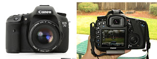
One very important skill we have developed over the past year is our use of the Cannon 5d, which we have been praticising with. We have praticed filming from different shots and angles, but whlist we were doing this we also experienced some difficulties with using this camera. A very common example of this is trying to keep the camera in focus when both the camera and subject are moving. Through praticising a lot with the camera we were able to overcome this problem. Whilst filiming our pratice teaser trailer we learnt that it's always benefical to film more than you need. This is because when it comes to the editing stage we'll have a variety of clips to choose from. We also learnt it's very important to lead in with 3,2,1 ACTION! and to lead out with 3,2,1.     

Post-production 


We will be using Final Cut Pro to create our horror teaser trailer in order to make it look as professional as possible. We already have some knowledge of using Final Cut Pro when we editied our pratice teaser trailer. This will be an advantage when it comes to editing our horror teaser trailer. Using Final Cut Pro can be very complex, so we'll be making sure that we either stay behind or watch numerous videos on youtube on how we can improve our knowledge of Final Cut Pro

Sunday, 20 November 2011

Practice Teaser Trailer


This is our practice teaser trailer which we filmed using the Cannon 550D and edited on Final Cut. By editing our practice teaser trailer this will enable us to be more aware of whats needed when it comes to editing our horror teaser trailer's. Our practice teaser trailer is 35 seconds and the fact that the length of it is short is very important. This is because when it comes to editing our horror teaser trailers, we would like it to be roughly under a minute. In addition, our teaser trailer is on youtube we will be asking people for there responce as to whether any improvements could be made, and what they liked most about the teaser trailer. This will important because any weakness that have been identifed we will then be able to fix. 


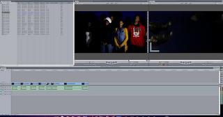
This is a screenshot of how we edited our practice teaser trailer, as you can see we did it on final cut pro, the bottom bar is where the editing takes place, where we input the the videos, filters & transitions, the 2nd screen is where we view what weve edited so far or the final piece, the 1st screen is where we can see the clips weve imported, then the box beside that where the writing is where the clips, pictures & music go after you have imported them.

Thursday, 17 November 2011

Ways in which conducting audience research through social networking sites and mobile phones can be benefical and not so benefical

In order to ask our target audience questions about what should feature in a teaser trailer and what atrratcts them most to a film poster, we'll need to explore our opitions such as using social networking sites like Facebook and Twitter. Seeing as how our intended age rating is 15, this will make it even more likely for people to respond to our questions seeing as how Facebook and Twitter is extremly popluar amongst teenagers. 

This will be very beneficial because the more people that reply to our questions will result in there being a better chance of us making a good teaser trailer and film poster. Although Facebook and Twitter are brilliant social networking sites to do audience research, mobile phones can also come into place. Blackberries are also very common amongst teengagers. In fact most of the people who we're aiming our teaser trailer at will have a Blackberry. Due to this, we'll once again be able to do audience research on our intended target audience, which is teenagers. In addition, Blackberries have the ablitiy to broadcast messgaes to all their contacts. So this could be a fantastic way to target even more people who may not be so interested in horror.  

Asking people a set of questions on Facebook, Twitter and Blackberry can also be time consuming so giving away a prize could be a good idea in order to encourage people to answer our answers. In addition, this might make it likely for more people to respond seeing as how they might be exicited with having the chance of winning a prize. After people have answered our questions, we will then screen munch and print screen the coversation that took place in order for there to be proof that we actually done all the research by ourselves. 

Theres also a possibility that we might even use MSN to do our audience research. However, not as much people (teenagers) use MSN as they did before, due to there being an increase in teenagers nowadays using Facebook, Twitter and now Blackberry. This has ultimately lead to a decline in teenagers using MSN, so we may end up getting a lower response from our target audience.

Overall, using social networking sites and mobile phones to conduct audience research will enable us to find any weakness that we'll be able to solve in order to make the best film poster and teaser trailer possible. With all of us having experience with conducting audience research through social networking sites, doing it through mobile phones (Blackberries) might be a new experience for us. This will lead to us developing new skills as the course continues.

Sunday, 13 November 2011

Questions asked to our target audience

As as a group we came up with ten good questions to ask our target audience. The purpose of this is to see whats popular with our intended audience and to highlight any areas we may need to improve on in order to achieve the best teaser trailer possible. In addition through asking our target audience questions based on horror films, teaser trailers and posters this will enable us to not only meet our needs but there needs also.

Q1. Are you male or female?  (circle appropriate)
Male
Female

Q2. How old are you? (circle appropriate)
15
16
17
18

Q3. How often do you watch horror films?

Q4. How much do you spend a month at the cinema? 

Q5. Which convention of horror excites you the most? (circle appropriate)
Violence
Blood
Weapons
Scream
Death
Isolated Areas
Other _____________

Q6. What was the age rating for the majority of horror films you watched? (circle appropriate)
15
18

Q7. Do you find Black and White horror films less intresting to watch? (circle appropriate)
Yes
No
      
Q8. How do you find out about new horror films that are being released? (circle appropriate)
Trailers
Magazines
Posters
TV

Q9. Do you think that a voiceover has a big impact on a horror film teaser trailer?  (circle appropriate)
Yes
No

Q10. What attracts you the most to a horror film teaser trailer? (circle appropriate)
Setting
Storyline
Soundtrack/Music
Actors 
Costume  

Q11. What type of horror film do you normally go and watch? (circle appropriate)
Slasher
Zombie
Thriller
Monster


Questionnaire 2 - Posters

Q1. Does the poster have any effect on whether you go and see the film? (circle appropriate)
Yes
No

Q2. What attracts you to a horror film poster? (circle appropriate)
Colours
Title
Images 
Other _________________

Q3. Would you expect to see the main character on the film poster? (circle appropriate)
Yes
No

Q4. What colours would you like to see on the poster for a horror film?  (circle appropriate)
Dark colours
Light colours
Other__________  

Q5. Which of these posters do you like the most?


Sunday, 6 November 2011

Textual Analysis Horror Film Poster

One Missed Call is a 2008 American remake of the 2004 Japanese film Chakushin Ari. about a phone call selected people recieve when its their turn to die, an alternate ringtone of the phone bearer will sound and when they pick it up its the sound of their last momments.

I believe that the poster is really good it gives a lot away with out really giving it away it makes their audience think about, The denotation of the poster you have the title of the film, the cover line which says “what will it sound like when you die” that automatically gives away the plot of the film, that the phone will give the sound of when you die. Then the picture in the middle where you have to mouths that look there in pain or screaming, and noses for eyebrows. 


Also the colors and fonts they use play a large part in the poster for example red Coverline with the serif font gives that scary statement feeling to it, then theirs the title with the ghostly look and the fade towards the bottom which may give that supernatural feeling to the movie. The colours used are very basic and vague but create a large effect a black background as expected of a horror film, then you have the face which is quite pale almost as if its a dead body thats lost its colour, then the font of the title which has a run off white.

The Mise en scene for the horror trailer, the picture init has a pale face that may represent death or dead bodies, also the smile when you have two screaming faces that counter each other, and yet I would still say it’s the smile that’s the scariest thing on the poster.

As you can see the props used in this poster is just the phone, but that one prop is signifcant as the whole film is based on a phone call, it allows us as the audience to have a greater feel of how much the phone means and how scary it is, it also gives us the idea of who might be on the other side of the phone when you pick it up.

The colours used are very basic and vague but create a large effect a black background as expected of a horror film, then you have the face which is quite pale almost as if its a dead body thats lost its colour, then the font of the title which has a run off white.

Saturday, 5 November 2011

Audience Research Mood Board

This is our Audience research in a mood board we put a bunch of pictures that would represent our target audience & what we are aiming to do. As you can see we have the bbfc rating of the age 15, this allows our film to have a strong horror & menace about it which is what we are trying to do, it also allows drug usage to be shown but not promoted, the only problem is when it comes to violence the pain should not be dwelled on & we are plannng for our film to as scary as possbile which will mean we will need to be specfic on the pain that will be inflicted in the film.   We also put film posters that represent our film in some way or another for example Halloween which is a slasher and Paranormal Activity 3 which is an psychological.these are the films that are team are trying to resemble, so the audience that  those films applied to would be mostly likely the same audience that we are also applying to.

Tuesday, 1 November 2011

Textual Analysis; Magazine Front Cover (Dominic)

Fangoria

Fangoria is an internationally-distributed US film fan magazine specializing in the genres of horror, slasher, splatter and exploitation films, in regular publication since 1979. The instinctive bold red masthead in a unique typography that is traditionally presented on the magazine would distinguish to regular reader or any new audience that this is the authentic Fangoria magazine, therefore attracting them towards it. Red has connotations such as danger, anger etc but because this is a Horror genre magazine red is conventional and suggests blood and gore which is suitable for the image of the magazine and purpose as red is a distinct colour thus attracting the audience’s eyes. Another standard generic magazine feature that is on front cover is the bar code in the bottom left hand corner automatically categorizes the magazine as an item which can be purchased and is a component which all magazines must incorporate into the final design.
There are coverlines above the masthead and also down the left hand side of the cover so the layout of the magazine is orthodox with no challenges to the conventions of a professional magazine front cover regardless of genre. Behind the coverlines on the left hand side there is a graphical design of a film reel which makes connections with the magazine and the film genre further building the magazine profile and familiarising themselves with the target audience of horror fans and movie fanatics, the colour of the film reel purple and the bottom dark blue giving the perception of mould and ooze making it unsightly adding the “look away” effect that horror movies give their audiences.

To further emphasise this, the magazine uses words such as “chilling, terror and scream” all lexis associated with fear which adds to the impression that the magazine is trying to give off also the type is in yellow not giving off a subtle vibe but one of warning and precaution the colour allows it to stand out therefore making it visible and not fight with the background by blending in.

The images that go with the coverlines are also an eyesore as you have a close up of some type of creature with what looks to be a spear or sharp weapon lodged in their eye socket with their face in anguish and discomfort. The other image is of what looks to be like a zombie or dead corpse also a close up just revealing the face like the other image connoting deterioration, eroding and rot, their eyes have a sharp colour but they seem lifeless however the scars of their face accentuate the they could cause harm to someone imposing a scary and mysterious fright.

The main content feature of this magazine’s issue is Grindhouse a 2007 American action-horror/exploitation double feature co-written, produced, and directed by Robert Rodriguez and Quentin Tarantino. The double feature consists of two feature-length segments, Rodriguez's Planet Terror and Tarantino's Death Proof, which is a relevant feature for the magazine genre.

The image that takes the centre of the front cover is an extreme, straight onward close up of a creature/man with his face melted to the extend where you can see all his flesh coming from the skull of his face with the effect of creating discomfort towards the target audience. The close up is not just distressing but also stomach churning as their face is completely lost all shape and the teeth and gums are the only things in position the mouth of the subject is open so it is unknown whether it is open in a plea for help or open because their face discombobulated. The main coverline lets the reader aware of the film’s title, therefore it provides information as well as release a fear factor as the typography of “GRINHOUSE” is bold smudged in certain areas connoting that it has been stamped, mashed or grinded onto the magazine front cover.